art direction — creative
Accenture Consulting needed help with the tenth anniversary edition of the Top 10 investment banking challenges series.
The Brief:
The task for this year was to give the series a new look for the 10 year Anniversary. The theme we needed to leverage in our approaches was around advancing innovation through digital. Visually, it needed to stand out from previous editions and have some sort of wow factor. The website needed to be simplified and align to recent A.com guidelines.
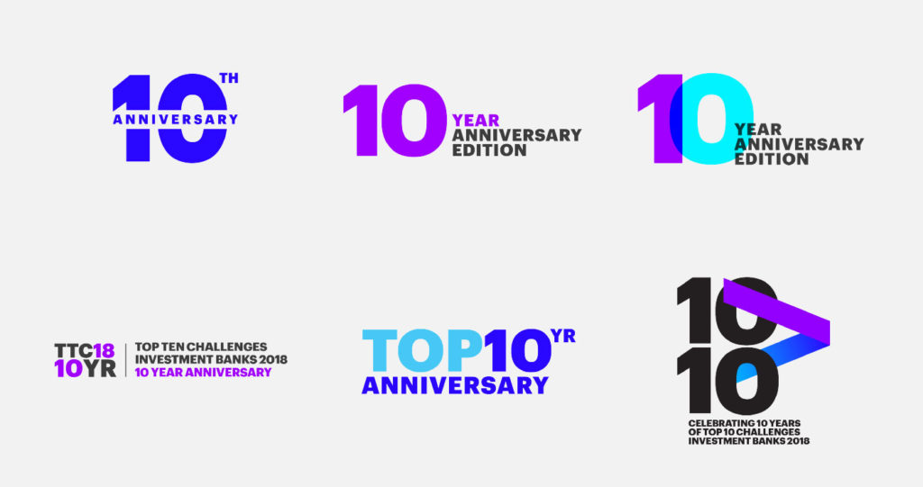
10 year anniversary mark
concept 1:
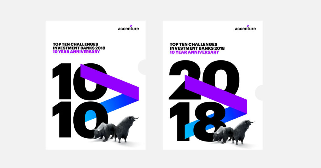
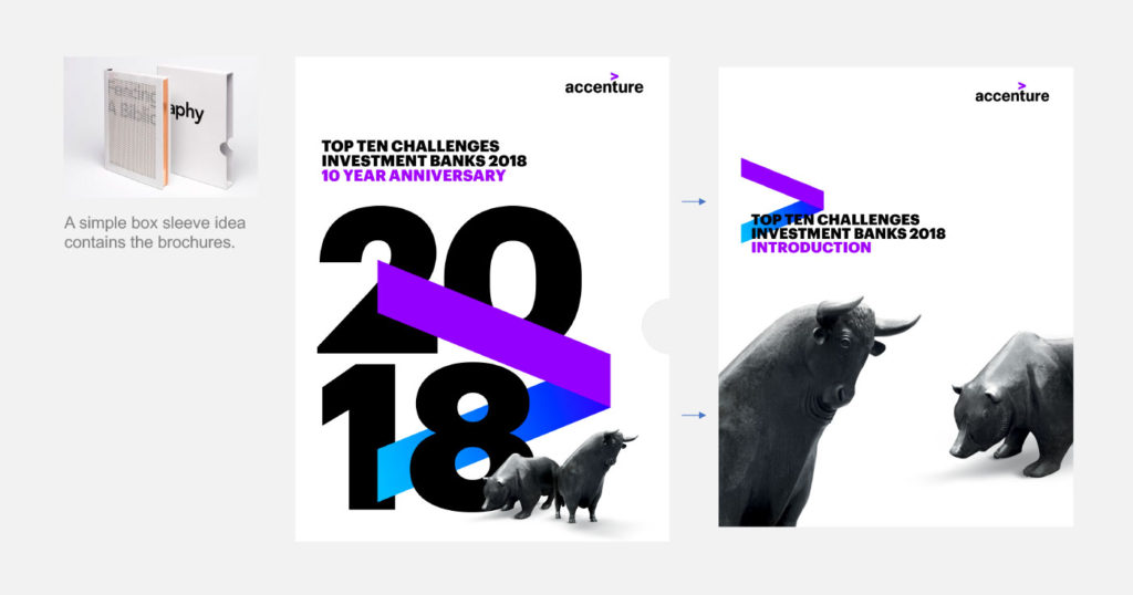
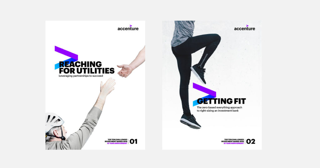
Bold typography playing on the 10 10 notion (years and challenges) is mixed with dynamic, new brand style photography, with lots of white space create a bold and impactful look.
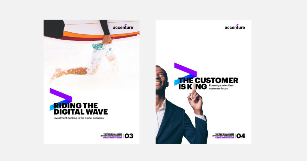
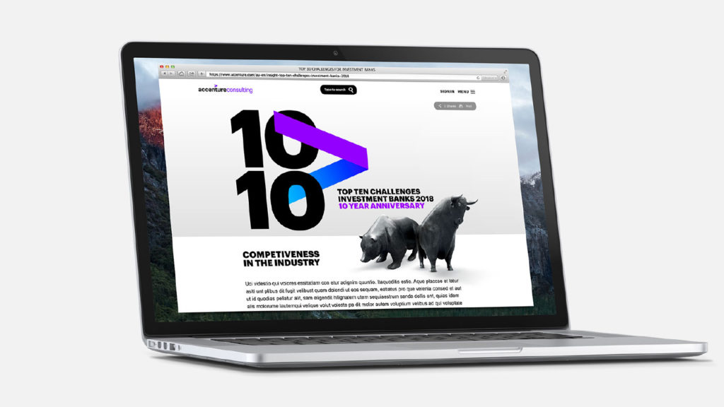
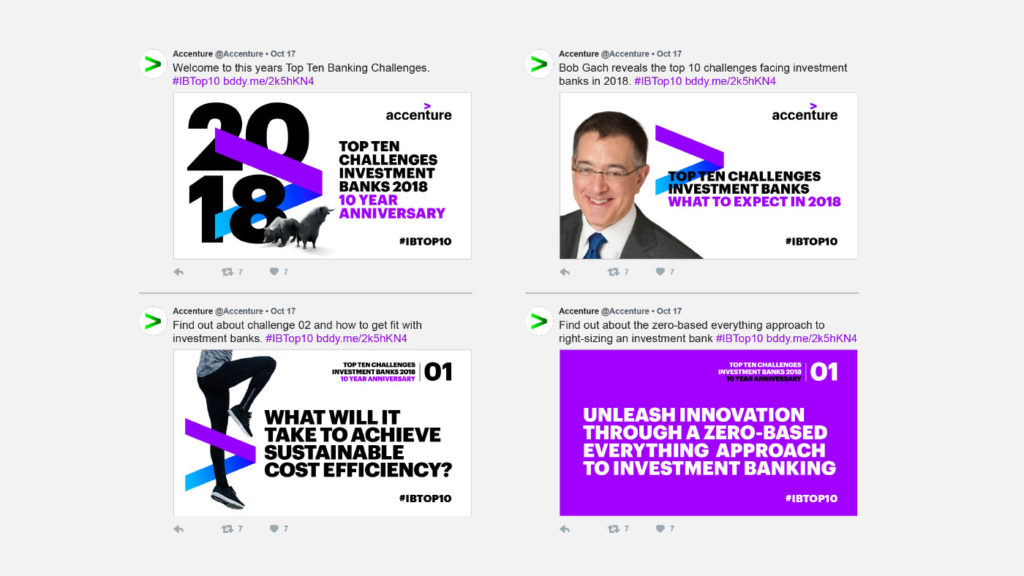
CONCEPT 2:
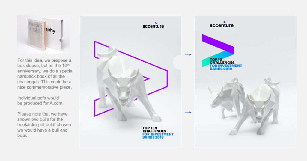
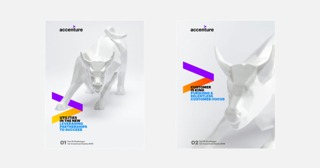
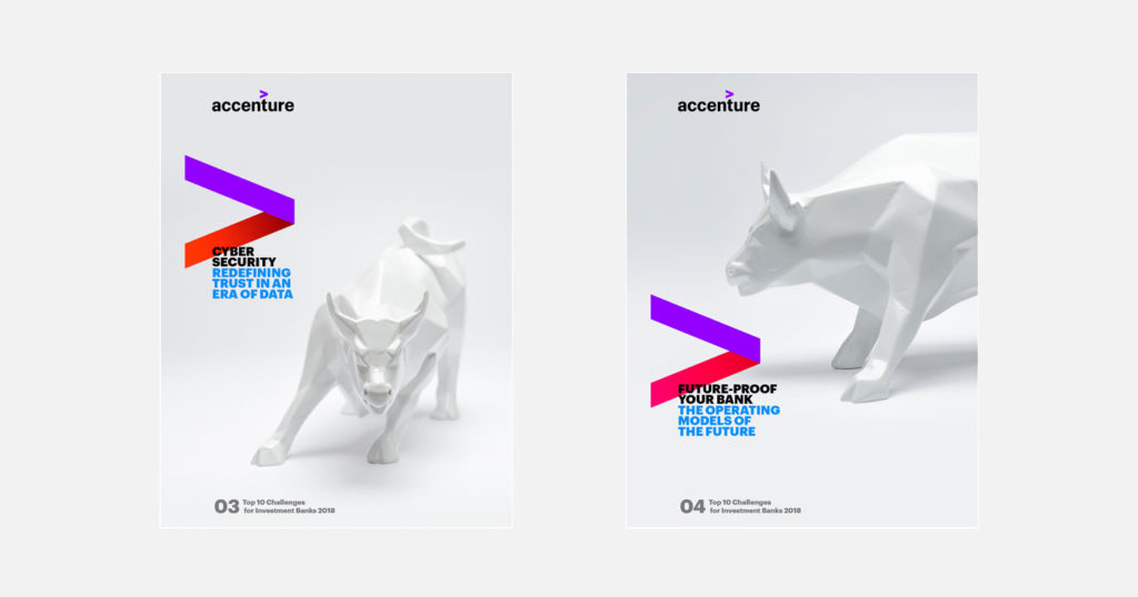
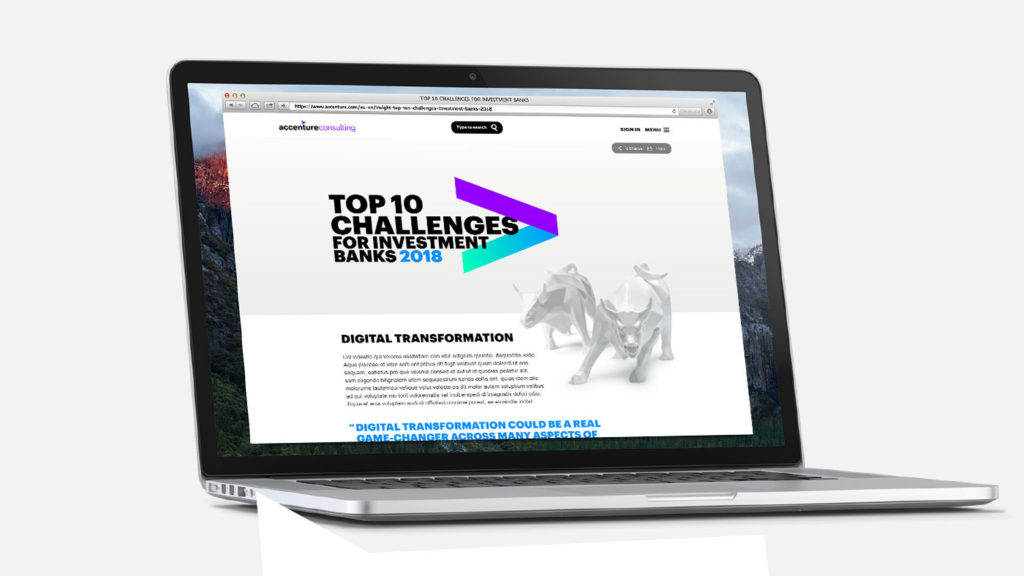
For this concept I proposed getting 3D printed objects made, going from normal to digital (Polygons or binary). This would help symbolize the notion of digital transformation. These would be shot white on white, creating a sophisticated and minimal look. For visual purposes we just used the same model for each challenge.
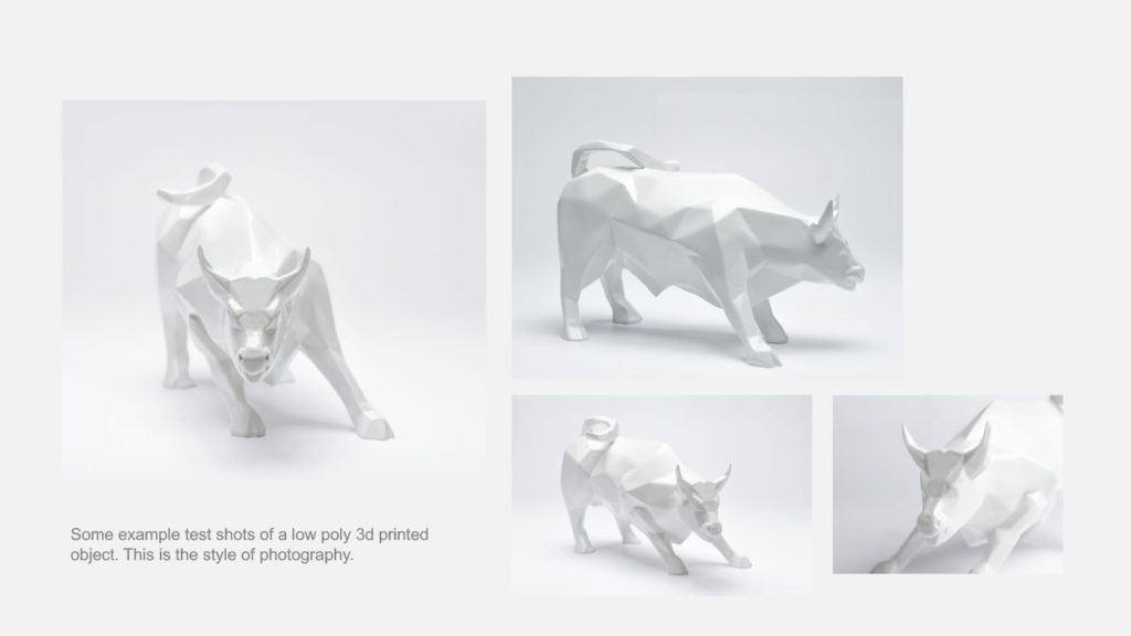
For concept purposes we got two digital (polygon) bulls made via 3D printing; in red matte and white gloss.
OUTCOME:
Concept two was the preferred choice and we started to get models made and photographed. Unfortunately, half way through production, the project was put on hold due to a Banking strategy change. This concept would eventually be repurposed onto another, but it never reached the heights of the potential we had visioned. Was such a shame but am proud of the work we did.
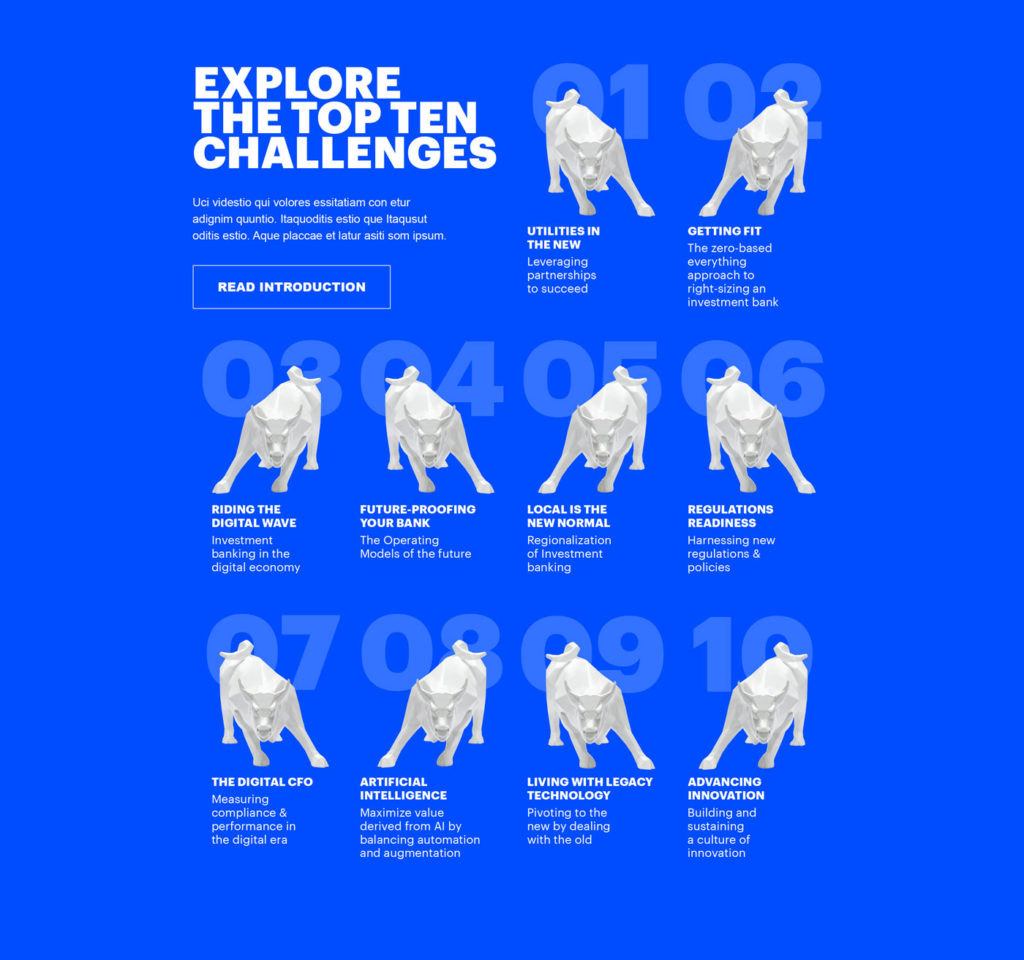
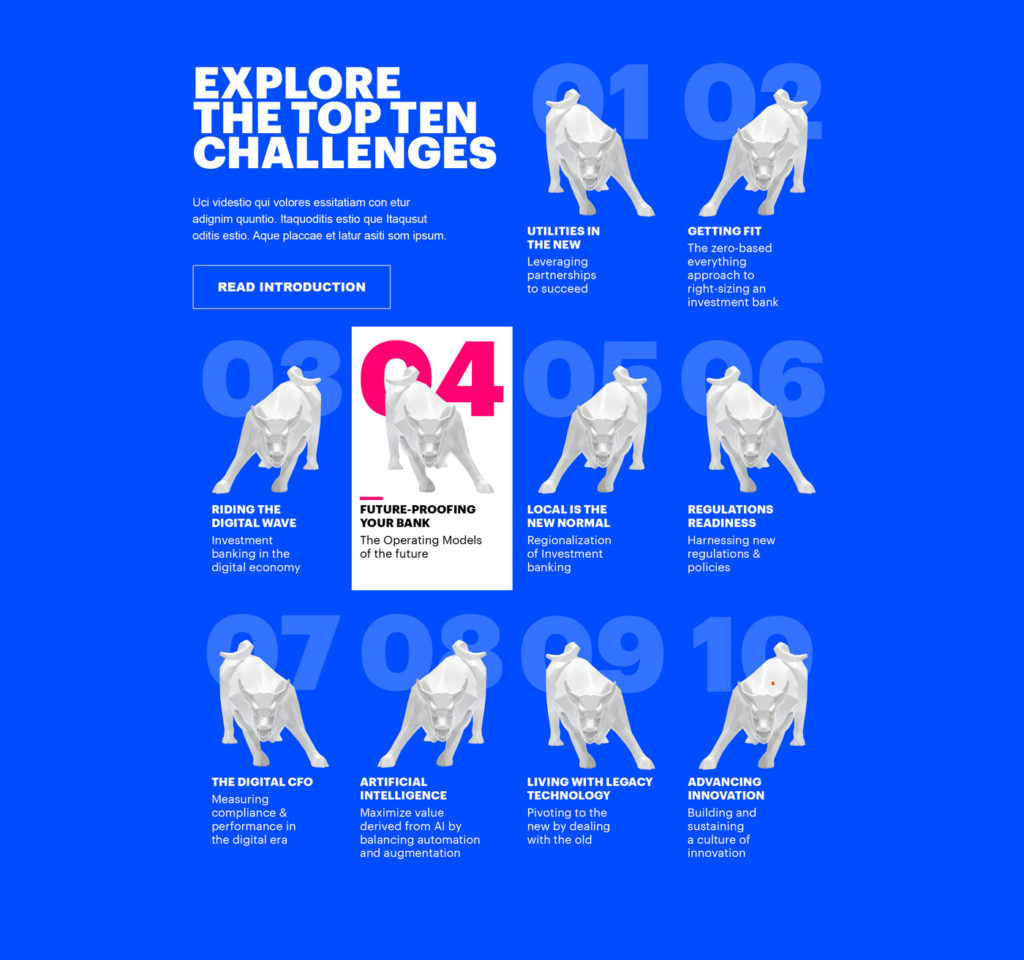
The challenge module showcases the 10 challenges and objects.
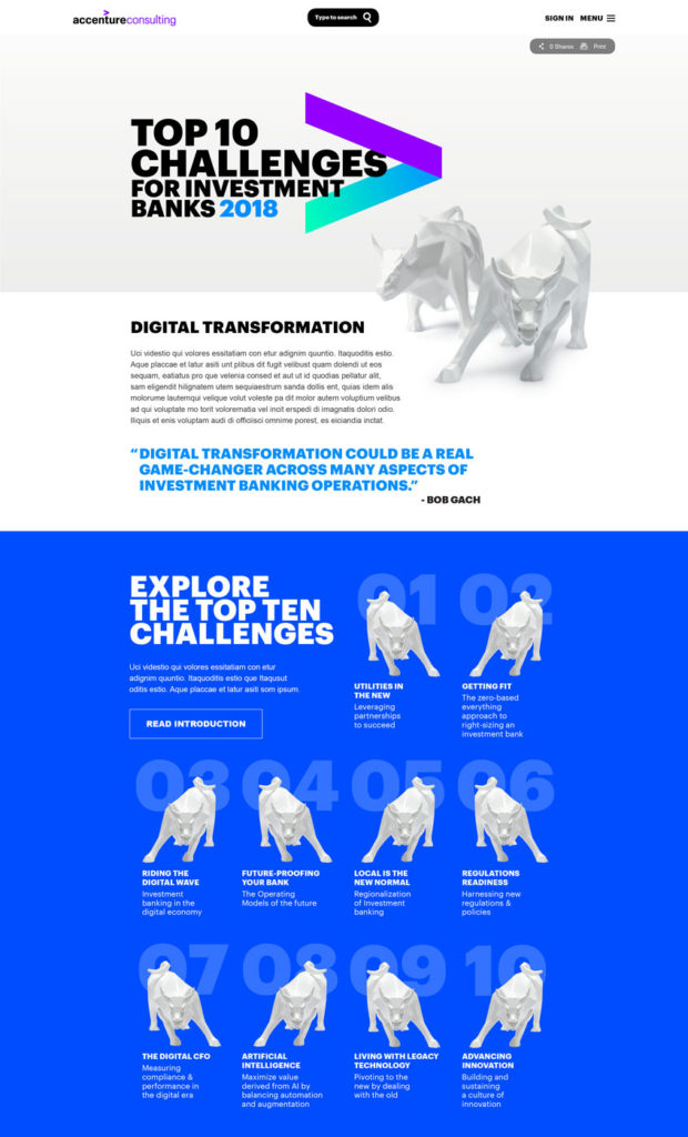
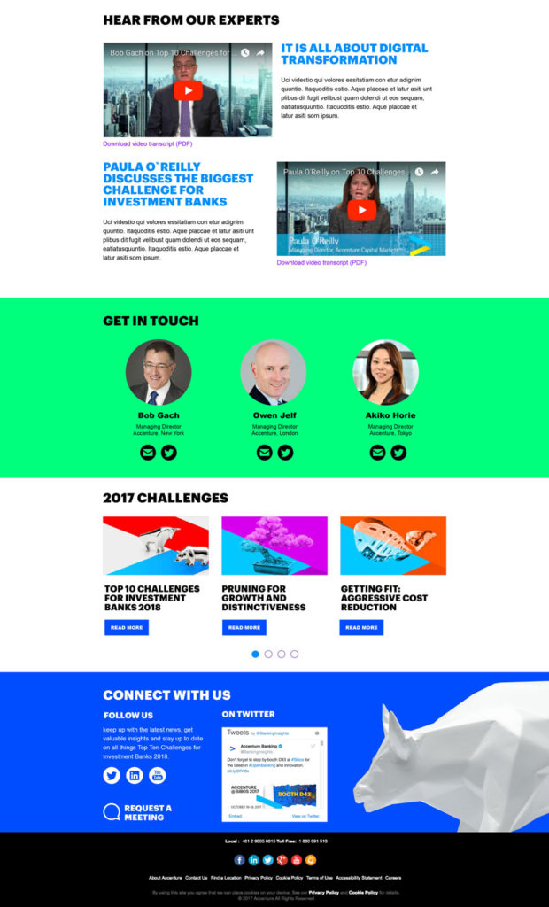
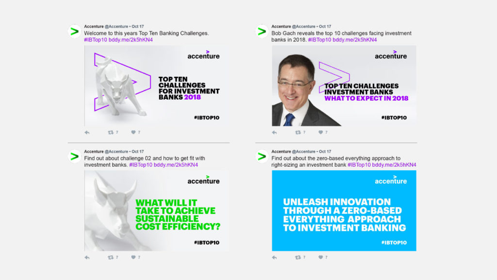
The elegant photography, the new vibrant colour palette, animated marquee and new challenge module to create a dynamic and colourful A.com page fitting for TTC18.

