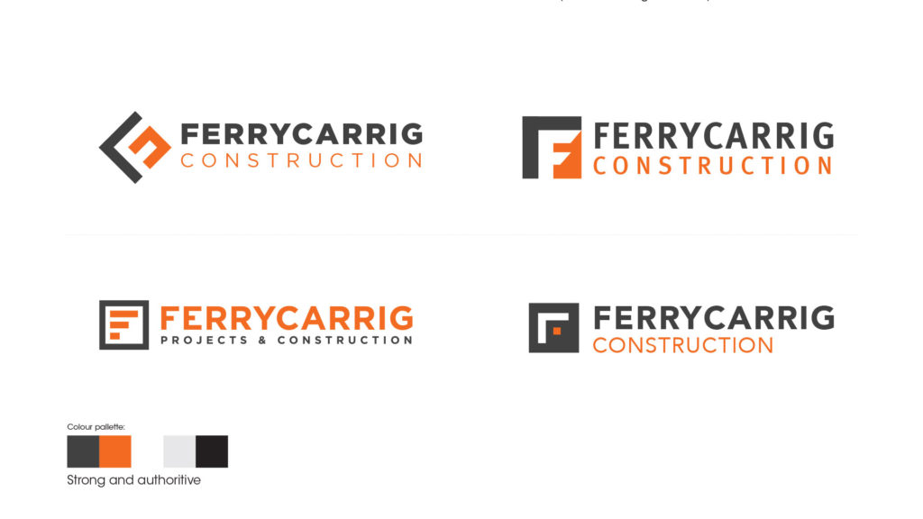
Logo design — art direction
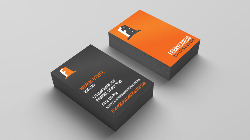
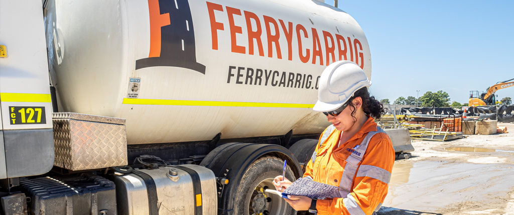
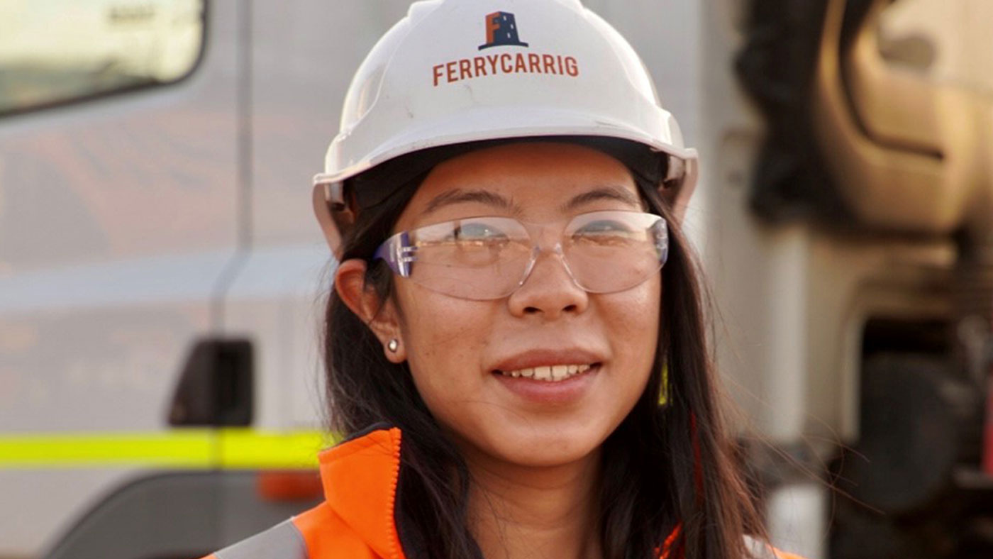
Brand identity to represent Ferrycarrig, and position them as an established professional construction company.
The Brief:
I was briefed to create a brand identity for Ferrycarrig construction, a relatively new company in Australia. The brand needed to evoke feelings of trust, honesty, integrity, safety, and quality. It also needed to portray Ferrycarrig as a great place to work, as well as exploring the associations of Ferrycarrig to Wexford.
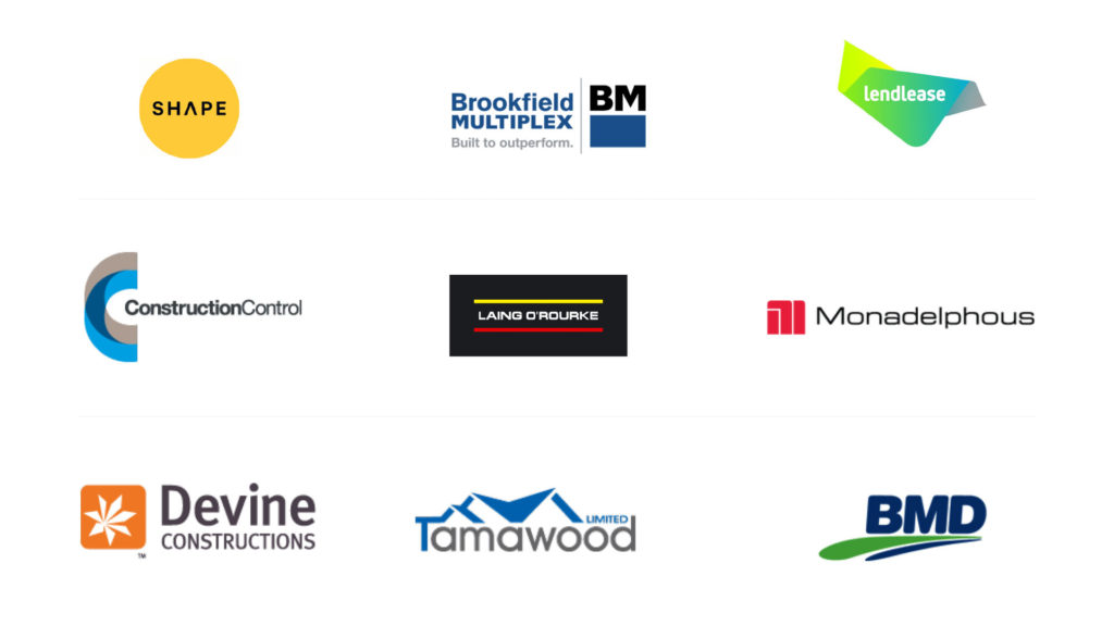
Market research—see who the competitors are
Concept one:
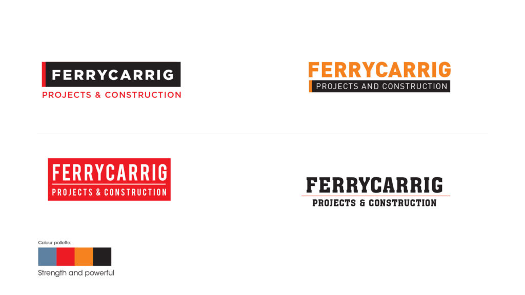
These logos use the negative space of a square to create a bold and impactful F. With a colour palette that’s associated with strength and power, it creates a very bold mark.
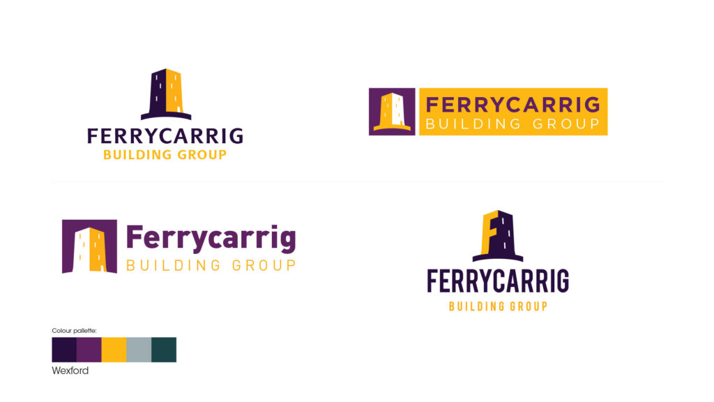
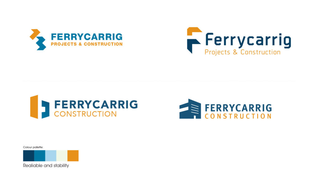
Concept TWO:
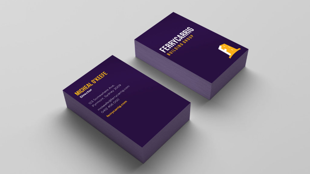
These logos are based on the Ferrycarrig castle, with colours linked to Wexford. This helps give the company an established feeling. Purple is a colour not associated to any big construction brands, so it helps differentiate Ferrycarrig from competitors.
Concept THREE:
These logos use 3D shapes to create an F mark and to evoke construction and building, with strong geometry and negative space.
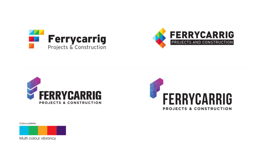
Concept FOUR:
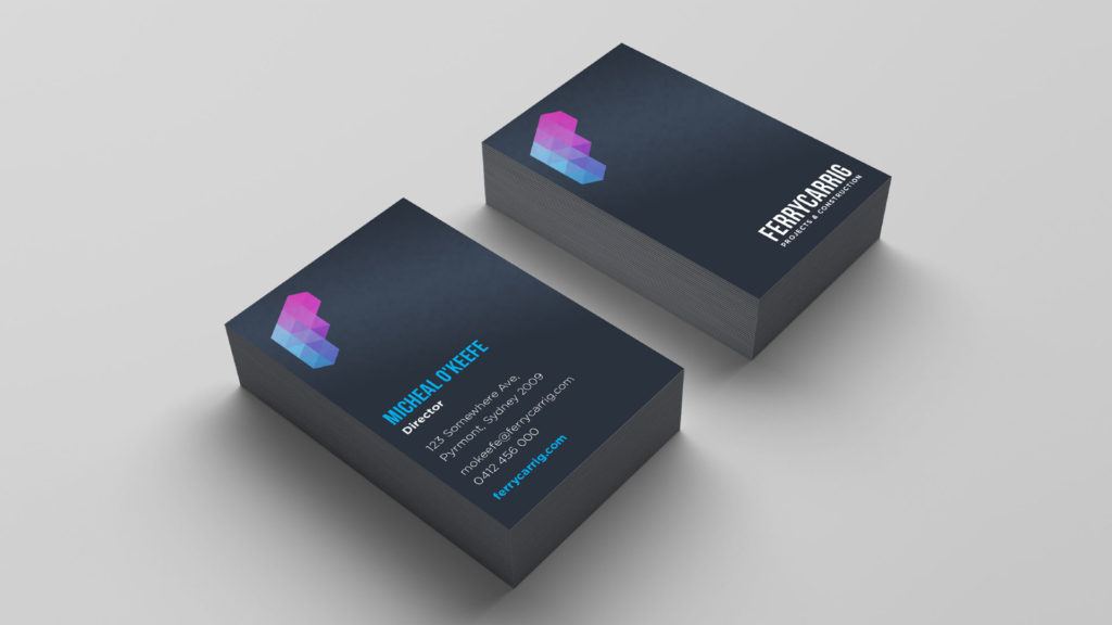
These logos are based on blocks and elements that combine and build the F in Ferrycarrig. This evokes a feeling of construction and building in an abstract, modern way. The simple and minimal marks are created and paired with bold geometric typefaces, as well as a bright colour palette to add vibrancy and impact.
Concept Five:
Here, a selection of classic bold typefaces form a simple word mark that could evoke a sense of professionalism and establishment.
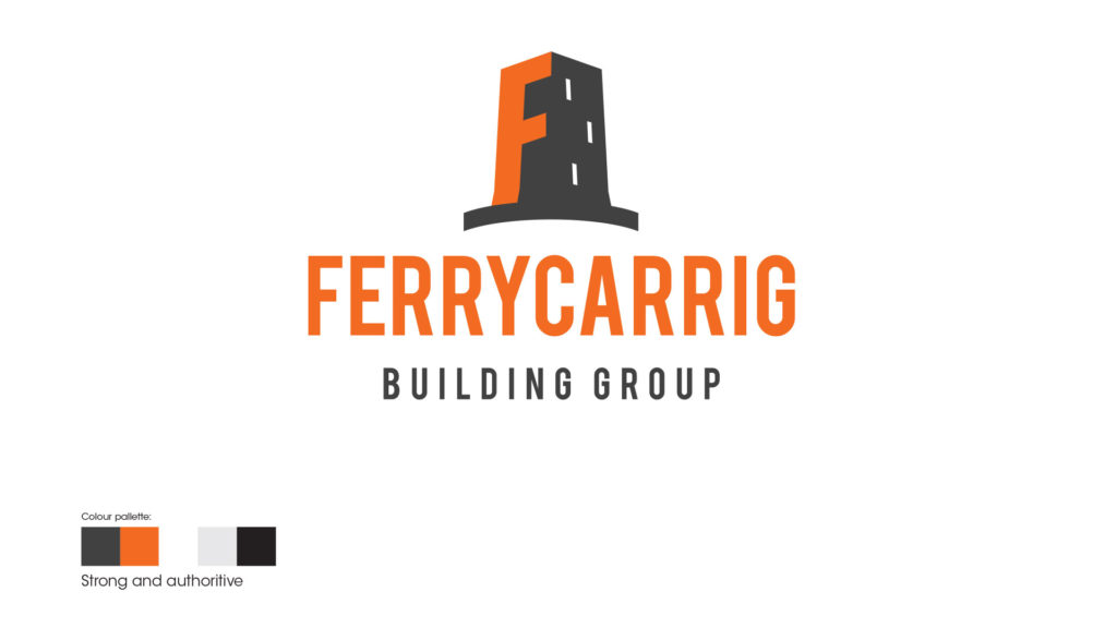
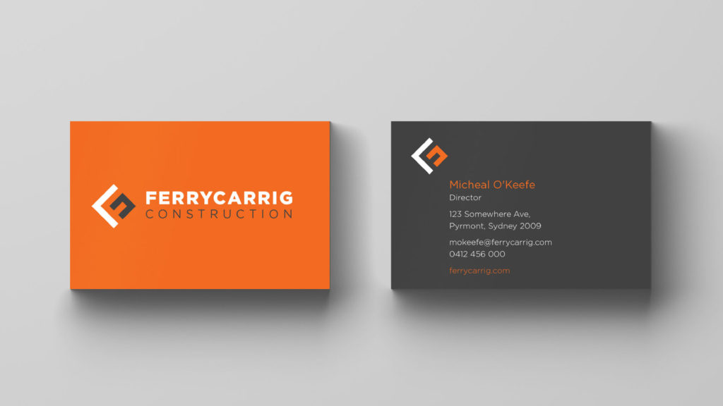
The solution:
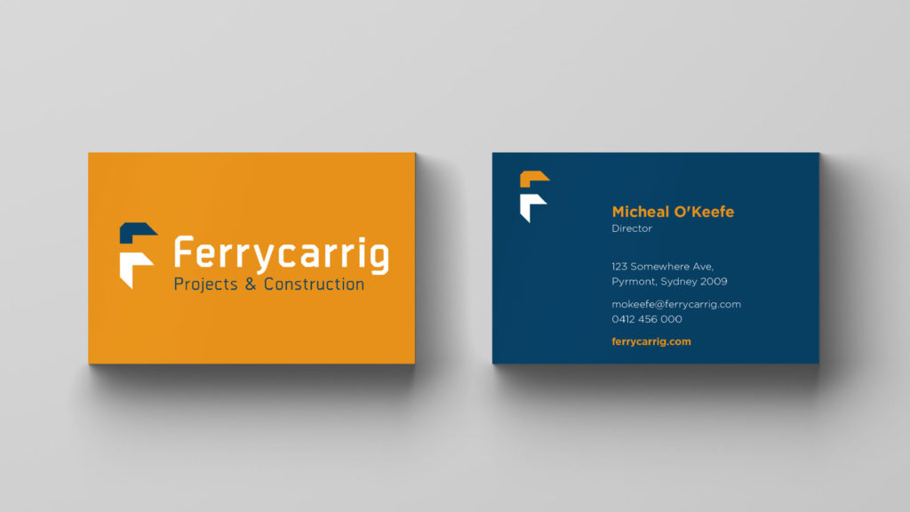
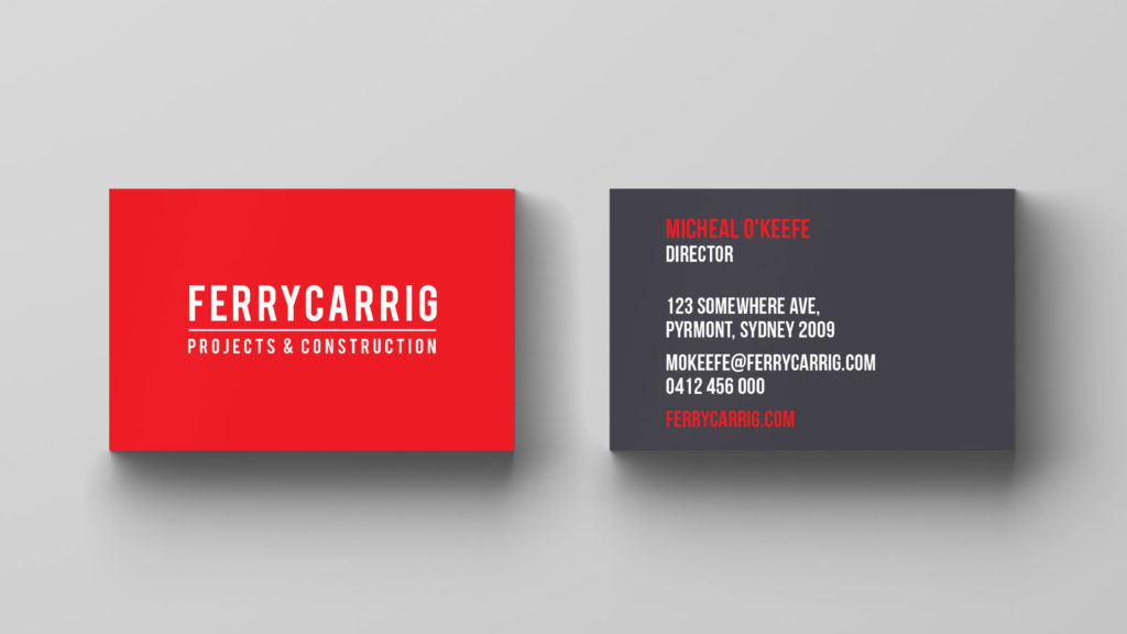
Concept two, with its adaption of the Ferrycarrig castle was the clear winner, but the client wanted to look at different colourways, which I explored in the next stage. The client ended up with a strong and authoritative logo, that could easily hold its own against the competition.