ARt direction — Copywriting — creative
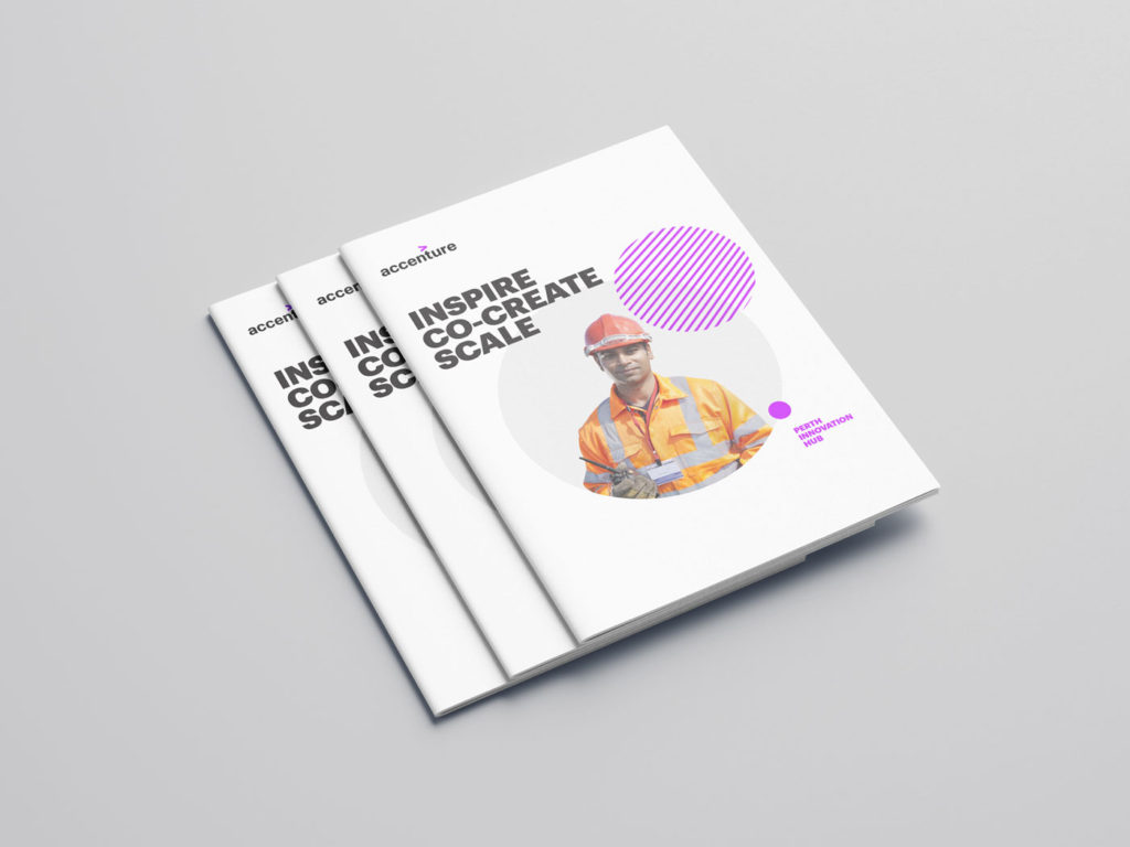
Accenture needed our help branding the Industry X Perth Innovation Hub, a centre of excellence for mining which would help clients reimagine their future.
The Brief:
In September 2020, Accenture’s Perth Innovation Hub opened in the global epicentre of the mining industry. It was to be the Industry X centre of excellence. Everything was hands on, from rapid prototyping to showcasing the latest digital technologies. The brief was simple: we needed to brand the hub, promote Industry X and tell the client’s journey from vision to value.
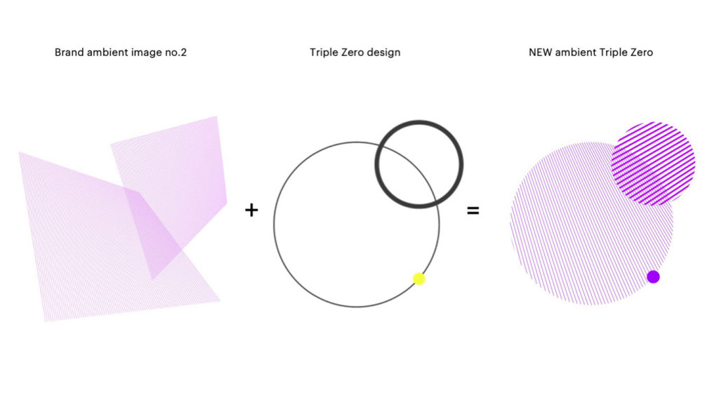
How we adapted the shape and brand approved ambient backgrounds to create something new.
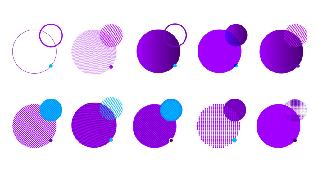
Triple zero shape exploration
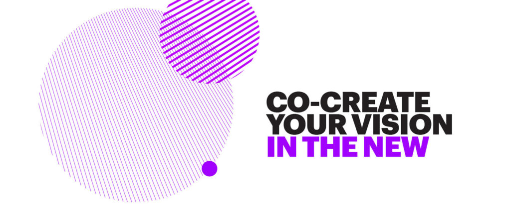
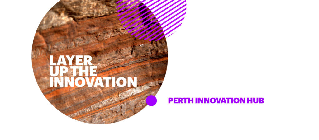
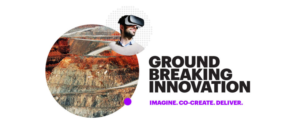
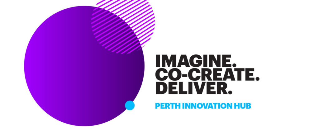


Application development—Looking at ways to adapt the shape
THE CHALLENGE:
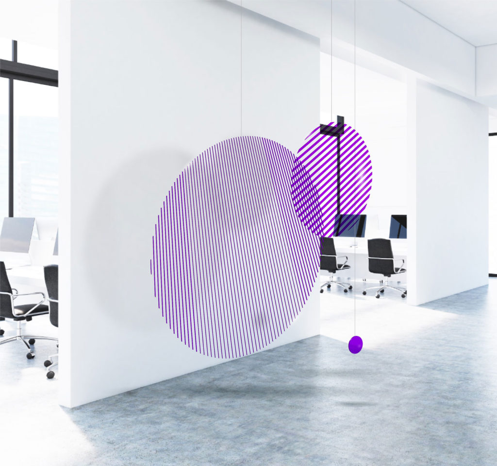
We had inherited a unique shape from the client—three intersecting circles (triple zero)— which we had to align to Accenture’s brand. It symbolised connection, motion and momentum with a subtle reference to Perth’s location.
We did this by taking one of the brand’s ambient backgrounds and adapting it to the shape. Once we had integrated the shape into brand, we could focus on the story and application.
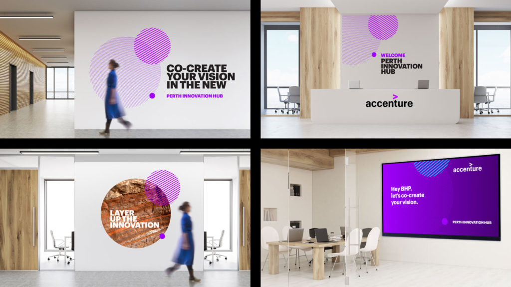
Interior application
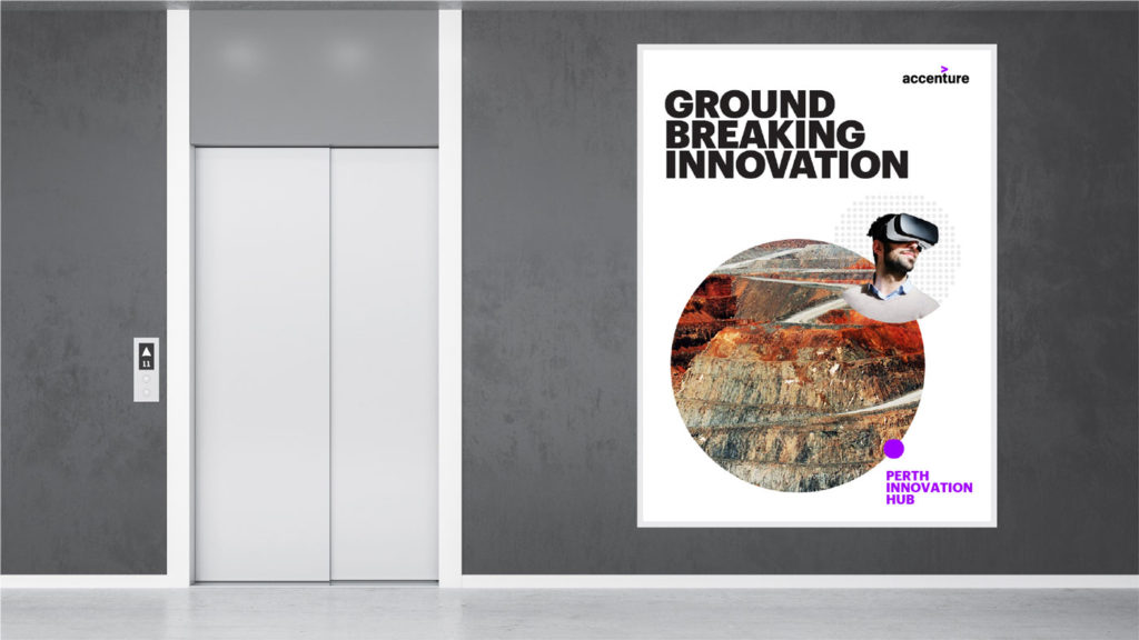
Using the supplied case studies, we can combine it with our Triple Zero expression to tell our client’s journey from vision to value.
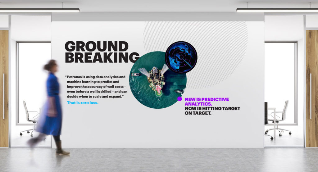
The solution:
We were able to develop a very ‘on brand’ application of the triple zero shape, creating a graphic language that could help tell the story of ‘From vision to value’. It was rolled out on all collateral and internal walls, and the client was very happy with the creative.
